Visualizing Change
A good behind the scenes look into how The Guardian is changing the way they use images in stories about climate change.
I think this is an incredibly important discussion to have for many of the reasons they denote – we all feel bad about the polar bear, but it doesn’t impact most of our daily lives and so, after a few moments of sadness, we move on. The emotional connection may be there but it doesn’t persist, we aren’t reminded of it as we go about our daily lives.
Images need to educate us about what is happening and resonate with us – that persistence idea is so critical. And the same applies to images in other stories – wars, man made disasters, natural disasters and even images of poverty. If the images don’t look like the things we deal with on a daily basis, then we are, effectively, othering the story which disconnects us from it.
This may be why I’m attracted to images of the vernacular, images of the everyday things in our lives. The work of photographers like Walker Evans and Fred Herzog intrigues me because it shows me the common things in life, the things I feel I may have or might still experience. It connects me, it shows something that is not other than what I am used to.
But this is incredibly hard to do. The impacts of climate change are both enormous and subtle. Massive storms are easy to visualize yet difficult to contextualize. The smaller, daily impacts can be easier to explain but harder to show. What does a 1.5 degree shift in average temperature look like? It is far too easy to get drawn into the extremist traps, leaving us with polar bears alone. We must do better.

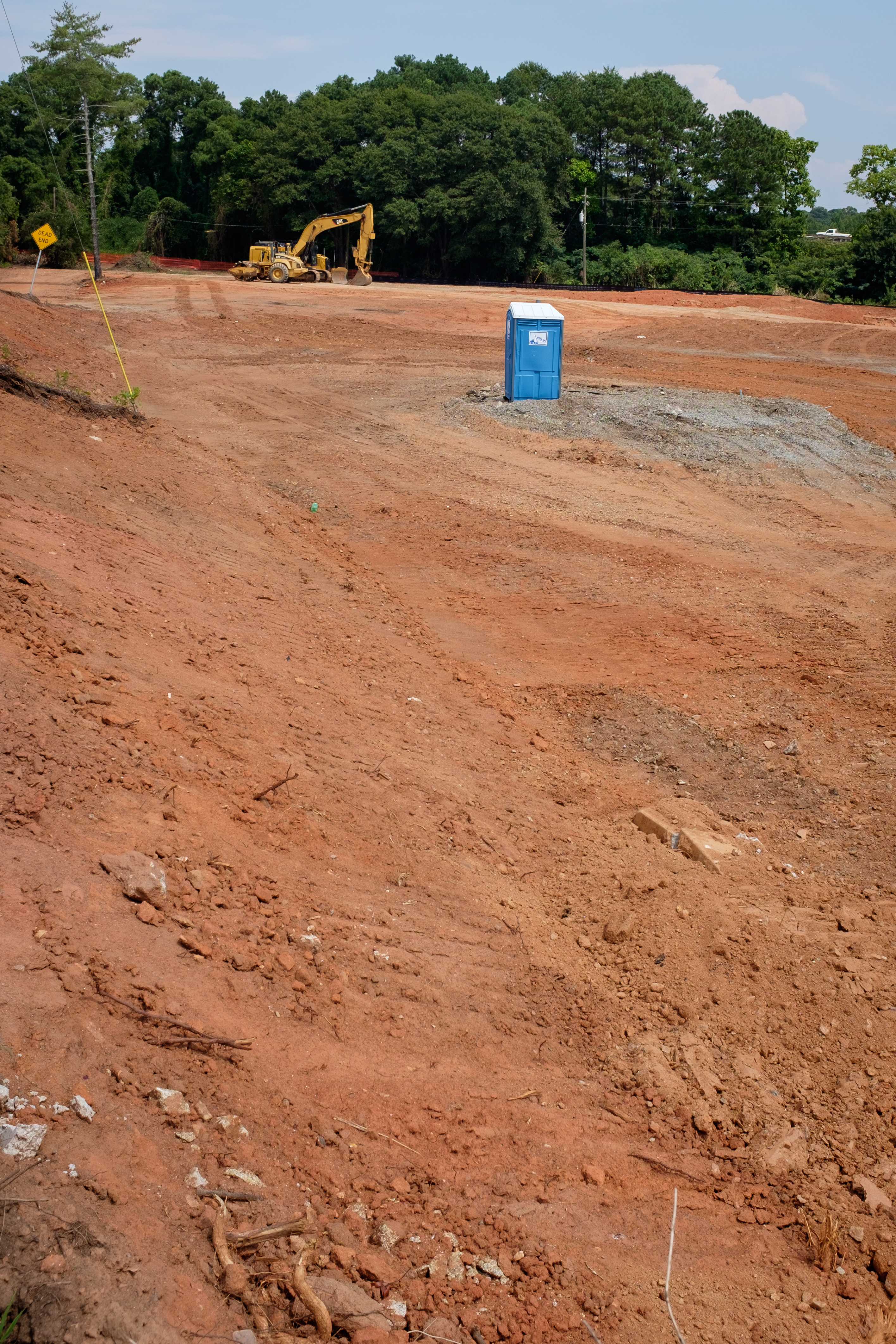
Land is cleared in Athens, Georgia, to build a new gas station. Even as fuel economy increases, fueling locations are becoming more common. (Photo/Mark E. Johnson)