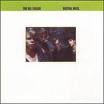
Cover Shots
 Khoi Vinh has a marvelous post up talking about album cover artwork. If you read through the comments, an interesting idea is pushed out … that newer records need to rely on bolder designs that are readable at a smaller scale. And not just because we’ve moved from albums to CDs, but that we’ve now moved down to that little square in the corner of iTunes.
 I admit to still having a sizable record collection – the big ones with black vinyl inside. I’ll even admit to having turned a few of my favorite album covers into home-made posters when I was younger, including The Del Fuegos’ Boston, Mass. and Foreigner’s Agent Provocateur. Why? They were clean and evocative of … well, whatever I was feeling in 1986, I suppose.
(Plus, who else but Dan Zanes could pen a line like, “I stayed awake last week …?”)